WUHU!

Just another WordPress.com weblog

Lino print September 23, 2010

Filed under: artworks — wuhuyumo @ 2:41 am
Tags:

We worked with Lino print in 2009 and it is really fun to do, mainly because its the first time and is different from the types of art that we usually do. The theme of the lino print is self- portrait, which is quite easy to do as the self portrait can be a simple portrait. This is because a lot of details are unable to be cut from the lino. However, after doing my self portrait, i faced another dilemma, which is the design of the background. I think that other than the self portrait itself, the background should show your personality. I do not think I did this well as i messed up cutting the background, so in a bout of quick thinking, I changed it into a jigsaw puzzle as a jigsaw was able to hide many of my cutting errors for the background. Also, i cut out all the pieces of the jigsaw to balance out the colour and white parts of the print as I am afraid that my print will come out too dark. The colour scheme was quite random in a way, as we did not have much time to print on the day itself and we had a deadline, thus i picked the print with the ink printed the most evenly, which happened to be this green one.

My pose was decided when i was browsing my Facebook photographs for inspiration for a self portrait. Thus, this print is adapted from a group photo taken at the end of Secondary 2 when we all missedcour class and each other. i am unable to upload the original photo as i deactivated my facebook account -.-


Inspiration from 798

Filed under: Inspiration — wuhuyumo @ 2:32 am
Tags:

Intro

798 is an area of old warehouses in Beijing which have been converted to various art studios. This post is more of inspiration rather than exhibition review as there are some stuff that i saw that has led me along with my coursework. We visited this place along with Today Art Museum as part of research for a small project that we did at the end of the trip. For our project, we act as consultants on relocation, and the mother of the imaginary family was a fan of contemporary Chinese art and as consultants, we were to recommend her art and artists worth adding to her collection. Thus, we did not go see Contemporary art such traditional chinese paintings that the Chinese are famous for, and instead, went to see  the art form more unique to the Chinese.

798 consists of 50s style military warehouses converted into individual art studios, housing  contemporary and avant garde Chinese artists. 798 is inspired by Bauhaus style of East Germany and is often compared to Soho, Greenwich Village and the Meat Packing District in New York City. I really like this place as it was art mixed with history, and its rawness and simplicity helped bring out the works of contemporary artists. They made effort to preserve it, restoring it to its former glory instead of turning this place into a state of the art museum etc. I really liked the exhibition space and its vintage effect, where there are a lot of communist writings and the ideas of Mao painted in a very significant red on the wall. I think the rich history is part of the reason why this place is filled with foreigners, up to 60% of the visitors are foreigners.

large, spacious exhibition hall

Inspiration

The main point of this post is how 798 inspired me, and what particularly inspired me is this statue which i felt was like the unofficial mascot of 798. This life-sized figure is available in many art galleries and many of them are randomly placed around the whole vicinity of 798. These figures may come in various colours and prints but are mostly red. They are called the “Ghosts of 798” and the whole collection is called “Stress- the ghosts of 798”, which is what i am feeling now trying to complete my SIA.

I felt that they are somewhat related to my coursework as they depict an abstract man screaming. Based on my contextual knowledge of the cultural revolution, communism etc, I think this sculpture is to encourage expression and to show the artist’s frustration at not being able to express his thoughts and feelings. Back in the 60s,

Disclaimer: The photo are not particularly clear as photography is not allowed ._.

This is the backview of the red and most common type. This gigurins have a rough texture though they are glossy. Also, as can be seen, they do not even have distinctive arms or legs.

Front view of the figure in multi colours. The white patch ( for the yellow and green figure)/ red patch (for the white figure) is in fact a logo which reads “798 Beijing”

Seeing this caption makes me wonder whether this set of figurines is part of a series of emotions, and is a themed exhibition, with the current emotion being stress. However, after research I realise this is not true. Moreover, i realised that this set of figurines are in fact, made by an Italian artist, Nicola Rivelli. I had always assumed that it was made by a Chinese artist to show their history, to show resistance to their previous creative stiflity. I think that 798 should focus more on works of local contemporary artists instead of international artists who like to make art related to the cultural revolution.

Besides this, my other inspiration is rather general, just to show the change in Chinese rt, to show how the Chinese :speak out: in their own ways through art, something that used to rare in China.

I think one form of contemporary art would be graffiti. Also, there was a public sculpture( 2nd photo) which is a BMW car made entirely in stone. I think this is quite an interesting idea and the stone and dirt colour also shows one of China’s problems of pollution.

Outdoor sculptures found around 798. The first and 3rd sculpture are done in neutral tones and are beautiful in a grotesque manner. The 2nd and 4th involves bright glossy prints, helping to ade the culptures more ‘loud” and eye catching.

From this visit, I have gained inspiration not just in literal sense, but metaphorically too as I take note of how the Chinese break out of their boundaries to create a new generation of Chinese art.


Class tee design September 22, 2010

Filed under: artworks — wuhuyumo @ 2:15 pm
Tags:

This is my class tee design for my class, 408. The colour is set on a purple background as that is the result that my class polled on.

Explanation for deisgn submitted to our form teacher:

It is no easy feat for a group of students and teachers to come

together as a group and in this case, a class. Especially hard when we are

in a world where there are many people. It must take quite a lot of fate

in order to have come together. The starburst represents that we had a

“blast” of a time together. The gun that consists of heart shapes

represent that we are eager to continue this spirit of 408 in future just

like how bullets in gun barrels are eager to leave the barrel when

triggered. Despite being a class that consists of girls only, our gender

does not deter us from doing things ourselves like participating in fun

fairs, pursuing further heights in academics. Hence, we have included a

more masculine symbol in our tee design.

However, my design is rejected by the school as the gun signifies violence. I did not think that this will actually get rejected as though it is a gun, the bullet holes are heart shaped for love and peace. This was not my intention at all as the”explosion” is to show a burst of vibrant personalities merged together. Since i was i was in Beijing when i received notification that my design was rejected, and i basically had no computer or internet usage, I was unable to make changes and the class moved on with a new design 😦


Today Art Museum September 20, 2010

Filed under: Writings — wuhuyumo @ 5:08 pm
Tags:

This is one of my favourite places that we visited in Beijing, the Today Art Museum. Usually, I’m not exactly a huge fan of art museums, mainly due to the bad impressions the ones in Singapore gave me, but i love this art museum as it focuses on more Modern art, which was quite interesting as compared to the traditional drawings that the Chinese are used to making. This is China’s first private, non-profit museum especially built to support the development of Chinese Contemporary art.

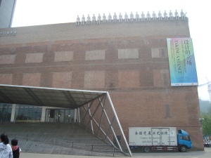
They say that the first impression counts and the first impression of the Today Art Museum was really good. There are some really cool figurines on top of the building. Also the stairs are basically a slope in the shape of a triangle leading up to the building. The stairs seem quite hidden and adds to the architecture.

Also, there’s these pretty cool sculpture outside> I’m not sure why, but characters like the ones below are quite common in the Today Art Museum, maybe because the artist is a prominent one in China? I’m not exactly sure as the i cannot find the information plaque for the below artist but i’ll try searching

For starters, it actually has a proper functioning toilet. And the toilet was actually rather cool. The toilet was a cross between a squat toilet and a toilet bowl and is in a square shape. The taps are really cool too as it resembles a fountain.

The main point of the museum visit was actually to listen to an artist talk about his work. As he was inaudible and had a unique sounding Chinese dialect, none of us are able to understand him and even our teacher guides fell asleep. Seeing that the talk was pointless, they gave us half and hour to walk around the museum. Though i might not be able to hear the artist, there are presentation slides and i had a rough idea of what he was doing and i thought it was a interesting idea. Basically, he made a life sized figure of a traditional chinese man, I think it was Qin Shi Huang. The artist brought this figure to prominent places in the world and photographed this traditional man in modern society, setting a contrast between the past and the present. Places included New York City, Paris etc.

Despite the large building, the exhibition hall was actually quite small, only a mere 1 out of 5 floors. I think that the cafe/gift shop/conference hall/ office took up quite a lot of the other space. This was the first exhibit and one of my favourite.

It is mainly glass jars of all sizes with different pictures printed on them. There are about 30 different jars altogether. As time was short, i did not had a long time to analyze them, it was basically a look and go process, but from my photos, the first set shows some everyday objects such as a fan, wok and scissors, while the 2nd photo shows organs such as the mouth and the brain. Im not sure about the 2nd collection but i think the first one represents the traditional lifestyle of the Chinese. Despite fans, woks, being everyday objects in most societies, these objects portrayed have a more “Chinese feel” such as the rattan fan ( used by the elderly Chinese), and the shape/type of the work which was popular in the 60s.

This is another one of those rather famous more iconic type of Chinese contemporary Art. Changes are made to cultural posters of the 60s on subjects such as the Cultural Revolution etc. These posters get a more contemporary look when combined with popular brands nowdays such as pepsi. I have a postcard of the same poster mixed with Mont Blanc pen print. I think it’s great seeing that China has developed that the people are able to take their history and add a modern twist to it. Also, their creativity is not stifled as before and artists are allowed to create works such as this with  a hint of irony.

Nice albeit simple installation. The painting shows a rock floating in the ocean and reflective rock statues in front of the painting sort of “extends” the work out of just the painting. There is a simple, peaceful way to it.

Finally, this is a video which intrigued me. it is actually really simple and can probably be found in our daily lives, but somehow i felt intrigued and I must have stood in front of the installation for 5 minutes. Video would be up as soon as i figure out how to upload videos.


Poster September 9, 2010

Filed under: artworks — wuhuyumo @ 5:35 pm
Tags:

It’s 1 am in the morning and i just completed my poster despite the fact that i decided to have a poster as a recent brainwave. The poster has been really fun to do and rather therapeutic despite the long hours of photoshop. I came up with the poster for the installastion so that the viewer can look at the chart and figure out for themselves which alphabet each hand sign represents. It gives the audience more involvement in letting them figure it out for themselves and seems funner that way. I start with taking a photo, such as the hand sign X has shown below.

Then i photoshop the background black, which is actually the most tedious part as i needed the get a even black colour, yet ensuring that the outline of the hand remains intact.

Cropping the photo to go in the poster, to minimise the space takenby each alphabet.

After this is done, i compiled it into a poster.

This was definitely the hardest part as i started out with a blank piece of paper, with no idea how to start. I settled on the number of hand signs per row (6,5,5,5,5) to maximise the space for each hand sign. The poster is still slightly cramped but it’s the best that i can do.

I chose to use photography instead of drawing it out is because:

1) Maybe it’s under all my research influence, or maybe it’s because my coursework is all white and light-coloured, I’ve always felt that the background MUST be black. The below piece of paper has been my most important piece of research for my coursework, between making each hand sign and using it as reference to photograph my hand signs and to make sketches of my final composition, I admit i stare at this piece of paper at least twice a week. After using google to find a full guide of American Sign language, the below piece is the nicest, yet the yellow is not exactly appealing.

2) I dont know how to draw white on a black piece of paper and i think white on white is too plain. Similarly, many hand signs are similar and i am afraid that they would look even more so after sketching it out. I wanted the hand signs to look realistic, thus i chose photography instead.

3) Instant turn-off from computer animation or whatever method they used, need i say more?

And after all this is an coursework I don’t exactly want to rip things off the internet so i made my own, which is tedious and boring but then again, it takes my mind of things and is secretly fun, though i’ll probably swear off photoshop for the rest of the year,


Public art SOVA assignment August 25, 2010

Filed under: Writings — wuhuyumo @ 2:39 pm
Tags:

David Gerstein
Title Momentum
Year 2007
Medium Painted Steel
Dimensions Height 18350mm x Diameter 11187mm

Background information

Momentum, which stands at 18.35m tall as Singapore’s tallest structure, has finally been revealed underneath its canvas on 20 December 2007. This 44 ton sculpture cost One Raffles Quay Pte Ltd S$2 million to develop. This sculpture is firmly hidden under canvas while construction, triggering the interest of the passerbys. Easch spiral tier is progressively unveiled, leading to the unveiling of the topmost sculpture on New Year’s Eve.

Feldman Method

Momentum is a steel sculpture which shows colourful figures in an upwards spiral motion. This sculpture is generally red, with occasional figures painted in bright colours such as blue, green, yellow etc. Each figure has different postures but generally show a sense of movement. The topmost figure is holding a spiral which gives of circular motion.

The sculpture’s layers upon layers of figures in an upwards spiral motion represent the populations high energy and a continuous cycle of progress. This work pays tribute to Singapore’s present and past generations, for without their toil, strength and ingenuity will not have become the dynamic metropolis it is today. The sculpture signals the vision, continual commitment by everyone to help steer Singapore into a vibrant global city. It is also a goal for Singapore, to be ever-improving gaining momentum along with the world as times change. The bright red colour gives a vibrant feel. Similarly, the bright rainbow colours add live and since each figure is painted differently, it symbolises the different races in Singapore and how we move on in harmony together. The figures are in poses of movement we shows that they have momentum and are everchanging and improving along with the times, to become the global financial hub it is today.

On the whole, though I think the sculpture is slightly out of place to its colourful and lively nature, I think the sculpture serves well as an icon of the CBD area. It adds life and colour to the business district and also serves as an encouragement to the people to gain momentum and continuing to progress. This is the goal of Singapore – to gain momentum along with the world as times change. Therefore, this sculpture successfully describes the goal of the country, serving as a reminder to the passerbys. Its whimsical, lively nature makes it stand out against the city skyscrapers, making it a unique icon of the city.

Environment and adjacent area around work

Momentum is located at Finlayson Green, which is the Capital Business District (CBD) of Singapore. The nearest MRT station is Raffles Place station. This sculpture is located in the middle of a busy cross junction along Finlayson Green, and its 18.35m height makes it a distinct icon around this area. Buildings surrounding this sculpture include AIA building, One Raffles Quay, One Marina Boulevard and Ocean Financial Centre which is still under construction.

Biography of artist

David (Dudu) Gerstein, born in 1944, is an Israeli sculptor. He is a sculptor, a painter and also an illustrator. He is most known for his sculture works, which are located worldwide, though most are still found in his homeland, Israel. He works in different metals and other materials. He creates dream-like figures in an attempt to break down the barriers between art and its audience. Gerstein creates universal colorful and layered images of still-life composition, urban landscapes and human activity, witch always retain local and autobiographical elements.

Site-specific

I think that this sculpture is indeed site specific. The location was first chosen, then One Raffles Quay commissioned David Gerstein to create a sculpture specific to this location. The main reason Momentum is placed on Finlayson Green is in hope that it becomes a landmark and icon for Singapore’s CBD district. I think the sculpture do serve this purpose as it shows many of the qualities of a blooming business district. It is in the heart of the CBD district so as to enhance the character of the city, and to act as a landmark for Singapore’s business and financial district. Developer of this sculpture, David Martin announced that “We hope the Singapore public will embrace this distinctive sculpture and in the fullness of time we believe it could become as iconic for Singapore’s business and financial district as the ‘Charging Bull’ sculpture is for New York’s Wall Street.”

Personal response

I like the sculpture as it well portrays the goals of the Singapore CBD. The sculpture suggests progress and improvement, which is what the CBD area is doing -to improve Singapore as a world renowned financial hub. The sculpture is also applicable to Singapore culture, with rainbow coloured figures which in a way represent the different array of races in Singapore. Thus, it shows a harmonious Singapore moving forward as a whole. The Christmas tree –like figure also reminds the public of its origin, as it is first unveiled on 20 December and the whole sculpture is unveiled on New Year’s Eve. The unveiling of the sculpture was quite an important and grand even back in 2007 and therefore, it can said that the unveiling of the sculpture is an event in Singapore history.

Also, I think this sculpture is beneficial to the CBD area as it adds life to such a serious business district. Momentum is a very lively, whimsical sculpture and would make its stand well amongst the skyscrapers of the city. It contains deep meanings yet it reminds the passerbys of the lively side of Singapore.


Decisions, decisions

Filed under: Inspiration,Writings — wuhuyumo @ 2:34 pm

I am currently at a dilemma for my coursework, as i am unsure of the exact tone i want to portray through my installation. Currently Ms Yap and Mr Chang suggested 2 different ways to present it and i cant pick!

One option is to paint the hand signs in different bright and glossy colours, so as to capture the viewer’s attention, which is what the phrase “Speak to be heard” is about. Bright glossy colours will attract more attention and may send out the message better compared to a subdued white.

Possible colour scheme, bright and glossy

On the other hand, another way of interpreting “Speak to be heard” is to say that you do not have to actually speak out loud, as in the case of the deaf and mute (thus the hand symbols), yet silence speaks and makes a impact. Thus, despite that white may be dull and subdued, and not “heard” not “seen: easily, it still makes a point and is in defence of these deaf and mute people, seeking to inspire them.


Inspiration for coursework August 24, 2010

Filed under: Inspiration — wuhuyumo @ 3:30 pm
Tags:

My first inspiration for my coursework came when i was clearing the house and i found my hand sculpture done in Secondary 2, when Mr Gan invited an external teacher to teach us casting. It left an lasting impression, as back in 2007 and 2008, our Aep class still undergo some mess for art lessons, such as doing Impressionism for 2 whole years and not doing much in art. Thus, casting was a new experience for the then secondary 2 us, who have barely covered anything in art, and as a Secondary 4 student, i was eager to revisit this medium.

Also, i read an exhibition design book and an exhibition by Archea caught my eye.

It is an exhibition for architect and design, done in 1992.

Also, I am deeply inspired by the CIP that i do. I volunteered at the Singapore Association for the Deaf, which assists the Deaf to achieve a better quality of life and to enable them to integrate and contribute to society. I feel inspired for this people, how they strive hard in life despite their impairment. For cca, I also performed once at this event which is to raise funds and awareness for the deaf. As a performer, it certainly raised awareness for me, and i would like to spread this message, to inspire and motivate these people.

Another inspiration is Guido Daniele She is rather famous for her hand paintings which are quite widely circulated around the internet such as

Despite the fact that her work is quite different from mine, but through my coursework and hers, i realised the importance of hands, especially to an artist. Our ideas for art might come from our brains but it is executed using our hands, and thus, our hands play a crucial role.


Pizza-so!

Filed under: artworks,Writings — wuhuyumo @ 1:51 pm
Tags:

Name of Artist: Pablo Picasso

Background: Pablo Picasso (1881 — 1973) was a Spanish artist and a prominent figure in the Cubist world.

Artwork chosen: Weeping Woman, because we studied this in Sec. 1 and have a fond first impression of it.

Proposed work: We have decided to make a pun out of Picasso’s name and turn Weeping Woman into a savoury pizza!

Here is a reproduction of Weeping Woman:

And a sketch of our original idea, which was to reproduce Weeping Woman in the form of vegetables atop a circular pizza base:

We have modified our original idea.  Instead of the pizza being the final product, our product will now be photographs of ourselves posing with pizza slices, much like the Weeping Woman is holding her handkerchief.  The pizza slices we will be holding will be cut out in angular shapes to emphasise Picasso’s signature Cubist style.

Ingredients: 3 12″ pizza bases, green, yellow and red capsicums, ham, tomatoes, pineapples, Mozzarella cheese, tomato paste, olives (for the eyes)

:)

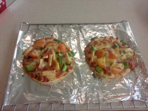
This is the final of our pizza. I think it was not that successful as to  portray the “Weeping woman”, but we did try our best to show the distinct characteristics of cubism, such as the choppyness etc. We used bright colours and our materials on the pizza are made out of various colours such as pink (ham), green ( capsicum), yellow (pineapple), red (tomato). We wanted to use blueberries at first as blue makes up a great part of the painting, but we took into consideration the taste of the pizza and figured that blueberry probably won’t taste good baked (unless as a cake xD)

Also, due to time constraints and the fact that everyone was too hungry, we didn’t get to pose as the weeping woman 😦 However, most people understood the gist of Picasso’s work through our pizza so i would still consider it an success ^^